macOS Mojave Review
Ever since I watched the WWDC last week I have been very excited to test drive macOS Mojave and most importantly dark mode! :O However I had an iOS app assessment and I didn't want to mess anything up with the beta of Xcode, or a new operating system, so my plan was on hold for a couple of days.
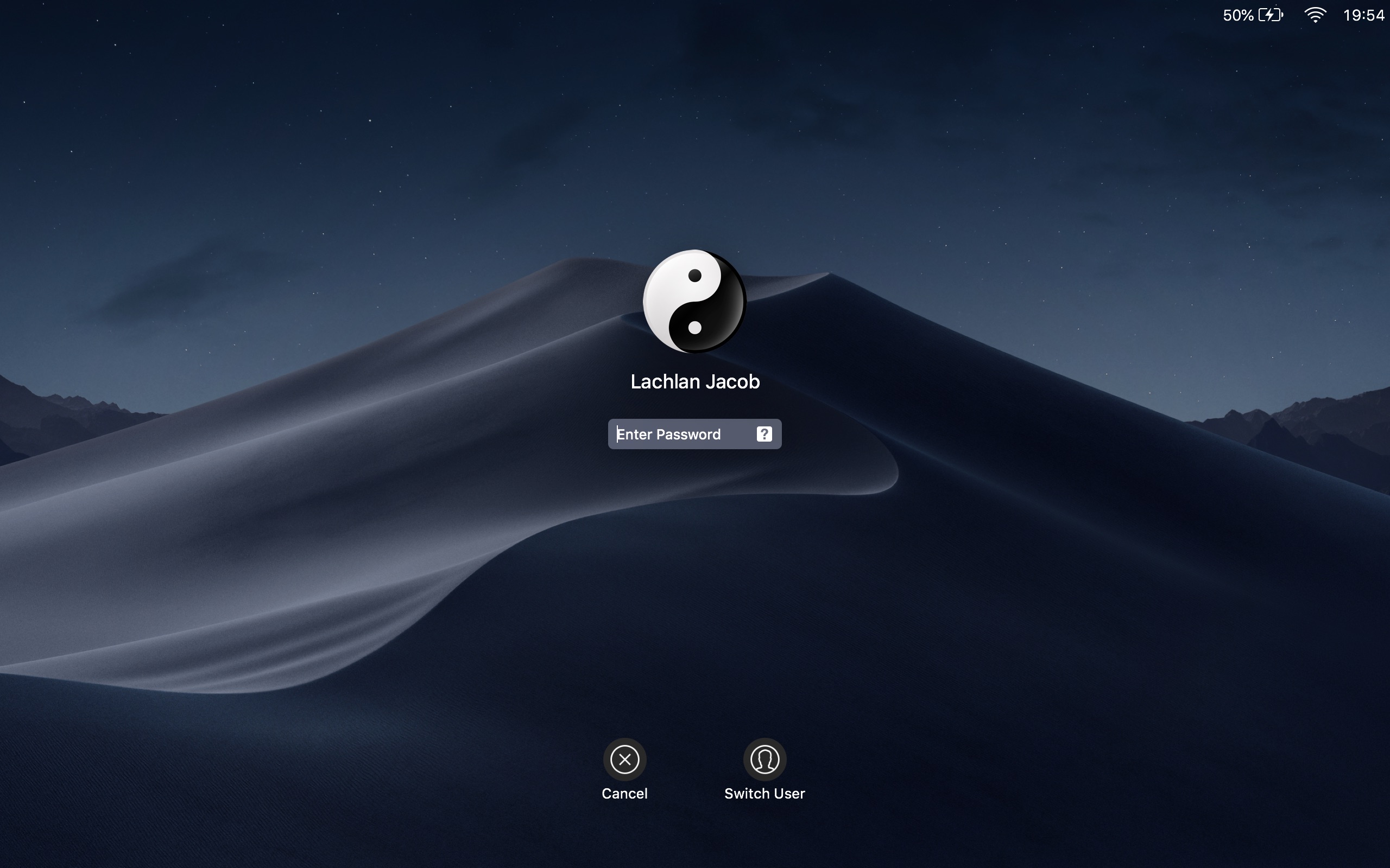
Eventually the day came, and as soon as I was done with my assessment I rushed back home to install the beta. After an hour or so of waiting for it to install I was in. The first thing I noticed was the larger icon on the login screen, after entering my password I was greeted by the beautiful Mojave wallpaper and prompted to select either Light or Dark mode. I didn't hesitate to choose dark mode, and overall have greatly enjoyed the UI overhaul this update brings to the Mac Operating System.

My experience thus far has been very nice, things are pretty clean and look really beautiful in Mojave, with a few slight exceptions.
I found that while I enjoyed the new look it was at times inconcistent and a bit unpolished. The volume UI is a weird mix of dark mode and light, as well as many apps were unsure as to their colour scheme. In terms of the user experience I have been pleasantly surprised at the relatively smooth experience the beta software provided. I've had a few crashes, and some apps are much more troublesome than others, but overall apps continue to run smoothly and I havem't noticed too many glaring bugs. A couple of problems with the new Finder view was the only thing I could find wanting on Apple's end. All in all I'm very impressed with the quality of this OS upgrade and commend Apple for their work. I look forward to continuing to test drive macOS Mojave over the coming weeks to get a better feel for it, and enjoy it, as more apps begin to suit the system.
Until next time, I'll sign off, stay tuned for more blog posts in the near future.
- etopiei (15/6/18)